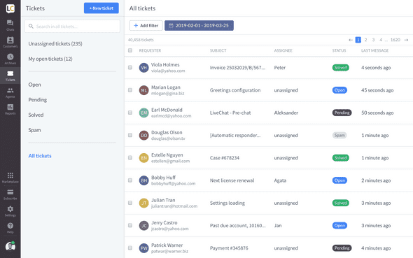
We’re continually working on redesigning our app. In the upcoming week, we will ship the Tickets section with a fresh, new look.
Tickets are a great way to handle cases that require more time and effort, and can’t be solved quickly on chat.
You can forward all your support emails to LiveChat, so all your support communication is handled in one place. Which means there might be a lot of cases stored in the Ticket section. That’s why in the redesign process, we focused on clearing & tidying up the view. Here’s a list of the most important changes:
See all tickets with one click
Now, you can see all tickets, with the click of a button. Which means you don’t need to know the status of a ticket to find it quickly (as it happened in the old design). To narrow the list down, you can use filters, e.g., date of last message or assigned group.
Clear and easy to navigate view
The redesign doesn’t only mean new colors but also a bigger ticket view, an easier to scan ticket list and decluttered ticket details. So you can spend your time on actually solving the case not scrolling and clicking through.
Add and remove groups assigned to a ticket
Now, you can not only add more groups to a ticket but also remove ones that shouldn’t be assigned to it. Which means less time spent on cases that are being solved by people from other departments.
Copy ticket URL
We added a button that lets you copy the ticket URL with one click. So you can share it with your teammates immediately. Saving a little bit of time when you need to work on a case with someone else.
What’s next
We’re working on the redesign at full speed and, soon enough you will see a revamped Subscribe section. Stay tuned for more information.
If you are not using the new design yet, you can easily switch to see what we’ve changed so far. To do it, click on your profile picture in the bottom left corner of the app and enable the new design option.
