It’s been hectic in here. We’ve been working on some powerful functionalities, and today we can proudly share the results! Ready? Buckle up and let’s go!
New design and new technology
Do you remember when two years ago we told you about having paired Backbone with React? Łukasz, our Tech Lead who has been in charge of the whole migration, explained why we switched technologies in this blog post. Today, a huge part of the Agent App is written in React and has a new design.
Although the migration isn’t over yet, we are satisfied that it hasn’t stopped us from developing our product along the way. The key to success was to divide the migration into phases instead of trying to rewrite the whole software at once, just for the sake of rewriting.
As Łukasz said,
“Paying off technical debt should not be the goal itself. It should come along with the new value-adding functionalities.”
Chat heatmaps
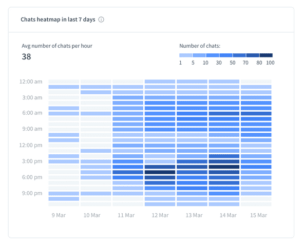
Along with the new technology came updates to the Reports section. We’re happy to share with you Heatmaps! It’s a new way of presenting data and it has the form of a grid.
Heatmaps are available for the following report types:
- Total chats
- Queued chats
- New tickets
Heatmaps are based on showing the intensity. They combine 3 factors: hours, days, and number of chats. In case of Total chats, you’ll see exactly when your agents received the most chats. It is analogical for the Queued chats report type. Heatmaps don’t incorporate any new data, but rather visualize it differently. It opens the door to more profound analysis, which in turn may lead to new conclusions.
It’s worth mentioning that the only possible time period is 7 days.
Effortless comparisons
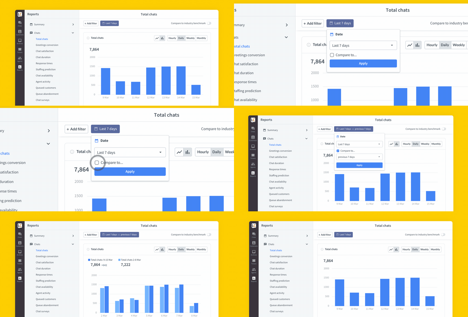
Up until now, comparing two charts has been possible, but involved significant effort. What you need to do is export the charts to CSV and correlate them manually in Excel (or any other software of your choice). Well, those days are gone.

From now on, you don’t have to export your reports unless you want to- the option’s still there. All you need to do instead is choose the time periods you’d like to see the correlation between, and that’s it. You can play with options comparing the last 7 days to the current week or the same period last year. You can also choose a custom period.
We belive this feature is crucial to observe the correlations, which often go unnoticed. It helps you spot even the most subtle nuances and trends. Making chart comparisons should be a breeze. We hope it finally is.
Your turn
This time it’s us who made some tweaks in the Reports section, but options are endless. There surely are business cases where our customers need to correlate different data and we don’t provide any suitable reports. This is where you can come in and create a new report type, which will be published on Marketplace. We’ve already mentioned this possibility in Building LiveChat Apps. If you’d like to know more about making profit from your apps, make sure to check out How to monetize apps.

