
Redesign is sexy. Almost every designer feels like a kid in a candy store when thinking of it. It’s a great way to prove and develop our skills as well as bring a breath of fresh air to the product we look at each day. Well, it’s not that simple. At LiveChat, we’ve come to realize that redesign is a difficult process in general. It requires cooperation between many teams, some good planning, and taking into account multiple factors - visual design being just one of them. While it may not be as appealing as it seems, a well-performed process gives the product teams lots of satisfaction and knowledge about users. Most importantly, though, a deliberate redesign brings great value for present customers and gives you a chance to re-engage the churned ones.
In this article, I’d like to describe how we dealt with this process at LiveChat, what we had to face, and what we kept in mind when making decisions. I hope our experience will help other teams that are going through the same or plan a similar process.
Why we needed the redesign?
The tech world moves so fast that at some point, almost every product needs modernization so that it can still bring users great value. LiveChat is no exception. The way of communication has evolved over the past few years, and what used to work may not be enough anymore. We’re continuously getting to know our users and learning what’s important for them in their work. We see there are many ways to run a business, so we want to make LiveChat flexible, more powerful, and more suitable for our users’ needs.
We haven’t changed the look of the LiveChat app in several years, and we felt that the current design and technology left us no more room to maneuver. In recent years, the number of online conversations has significantly increased. Messages can come from all sorts of new sources, such as Facebook Messenger, Instagram, or WhatsApp. Communication often lasts longer than a single chat or is being carried out through more than just one channel, so we want to be sure to reach out to our customers in the most convenient way possible. The market already offers many well-performing apps, which enhance customer service. We wanted to open up our product to be able to integrate with those apps in an easy way.

All those aspects were not taken into consideration when building LiveChat a few years ago. Back then, LiveChat was a monolith, not adapted to expand. The stiffness of UI wasn’t much help, either; designing new features was a struggle. It came down to searching for a new place to add those features, which is never the right way to go about it. For these reasons, we could not give our customers and ourselves a complete freedom in tweaking the product and adapting it to specific and modern needs - we needed the platform technology for all of that. Hence, the decision to create a new version of LiveChat was a natural consequence. Our move from a monolith toward a platform required a complete change of approach - from the architecture and technology to the design and business strategy, so the entire company has been involved in the process. Thanks to that, everyone was on the same page, and we all felt responsible for what was coming. We’ve worked closely together to deliver the best quality. After all, redesign is a team sport.

Revolution or evolution?
The process of redesign can be a total revolution or a series of incremental changes. We decided to go the second route and deliver the new parts of our app in the form of digestible chunks, one by one, so that users have some time to adapt to changes. From the beginning and throughout the redesign process, we’ve allowed users to switch between the old and the new look. Sure, it adds the cost of maintaining two versions at the same time, but it also gives users comfort - with the ability to choose, users are more willing to test the new view.
Every change is an effort for users because they have to take time to learn new things and develop new habits. We reduced this workload by carrying out the redesign process step by step. When we shipped the first section as a part of the new look & feel, we knew it would have the biggest learning curve. Since the next changes followed suit, and used already familiar patterns, they were much easier to cope with. To make the redesign less painful, we invested a lot of time in research and gathering feedback. We wanted to understand what’s essential to our customers and how we can let them maintain their existing habits in the new version of LiveChat.
To reduce pain even more, we developed a rule that the team responsible for launching a particular section would help our support team chat with the users right after the release. Thanks to that, we were able to catch problems and bugs with ease and quickly fix them, so our users felt cared for. With each release, we observed more and more positive reactions. Some of our customers even decided to start a chat just to tell us a couple of warm words about the changes. At that point, we knew that we were heading in the right direction. It was really motivating!
Opt-in or opt-out?
It’s worth taking the time to think whether redesign should be opt-in (we inform about changes, the user decides whether and when to switch), or opt-out, which is actually about forcing a new version upon everyone. The first method is safer, but the tricky part is to convince the user to switch to the new look. It can be difficult as people don’t like changes. On the other hand, the opt-out version is riskier. It will surely generate more frustration, but will also increase the chance of sticking to the new look from the very beginning, given it’s good enough.
We decided to go in the opt-out direction when releasing the first redesigned section. The new look was heavily tested by the users beforehand. We were convinced of its value, though it was still quite a risky move. We were sure that some unexpected situations would happen, and they did. For example, one of our customers was giving a presentation when the app, much to his surprise, changed its look. It was very confusing, to say the least.
Of course, there were some hateful messages and critical comments. However, there were also many warm reactions from the people who really liked the new look with all its improvements. After all, we didn’t observe any decrease in conversion to paying customers. Quite the opposite - the number of customers increased, and their positive feedback proved that it was the right decision.

Work closely with the customers - they are your experts
When it comes to design, it’s best to start with defining the main problem you’re trying to solve. Look at the big picture - what do you want to achieve with the new version? Work closely with your users to understand the problems and limitations of the current version - the aspects they struggle with.
As for us, we started by gathering feedback from our customers - what’s important to them and what frustrates them the most. We learned how and why they use our product, what their habits are, and even how they use workarounds to customize the app to their own needs. Those workarounds are especially interesting because they show all the deficiencies of both the UX and UI. Frankly, since we use our own product, we had some tricks as well. Armed with this knowledge, we started by creating a lot of prototypes, which we tested together with our customers. Based on their feedback, we iterated until we finally got a version that we were pretty sure of.
The journey doesn’t end with the release of any particular section. The team responsible for the shipped software part still works on it before moving to the next project. This is the time when we are fine-tuning the product. As we are lucky to have great users who provide us with valuable feedback, we collect suggestions and requests and try to implement them as soon as possible. For example, we added a small feature called “Archives list modes”, which turned out to be a significant upgrade for some customers.

As you can see, working with users is the lion’s share of the redesign process. If you don’t have a UX researcher on board, consider hiring one. Their knowledge and experience will help you extract the essentials from every feedback and go deep to the bottom of the problem. If hiring is not an option, a designer accompanied by a product manager should conduct the research. The return on the time investment is invaluable - you’ll be undoubtedly more aware, and your decisions will be more conscious and accurate.
Prepare your users for changes
Communication with users is crucial during the whole process of redesign. People adapt to changes better when they expect them, so let them know about your plans beforehand. If you know your customers and their needs, you’ll know how to encourage them to try a new version. Moving is fun only when you’re getting an upgrade, so highlight what’s new and improved. Let them be excited, not scared.

Besides the marketing aspect, early informing has one more tangible upside: the managers can update the training materials for their teams in advance. Furthermore, it’s worth to think about giving them early access to a beta version. It will surely help them prepare everything they need before the big update. Not to mention, they might give you constructive feedback as beta testers. Everyone will benefit from it.
Mistakes are part of the journey
Our path was not easy or without bumps, especially in the beginning. It’s almost impossible to avoid mistakes when going through such a complex process like a complete redesign. The thing is to learn from those mistakes. Let me share with you some problems we had to deal with and how we solved them:
- Lack of consistency. At LiveChat, several teams are working on the new look simultaneously, and each of them has its own designer on board. Because we were creating new views from the ground up, we saw differences in our designs from the very first pixels. It was clear that we needed a single source of truth, some sort of guidelines for our visual language. It led us quickly to the creation of our own Design System. It was a big challenge that required time and dedication. As for us, it took two committed people - a designer and a developer - to kick off the project. Since this is an ongoing task, which will be constantly evolving along with the product, the team grew over time. The cost of making the Design System was considerable, but the investment was definitely worth it. It sped up the work of all teams significantly, and our projects finally began to look consistent and organized.
The Design System has recently gone public. We’re sure it can help other teams in the development process. Feel free to give it a shot.

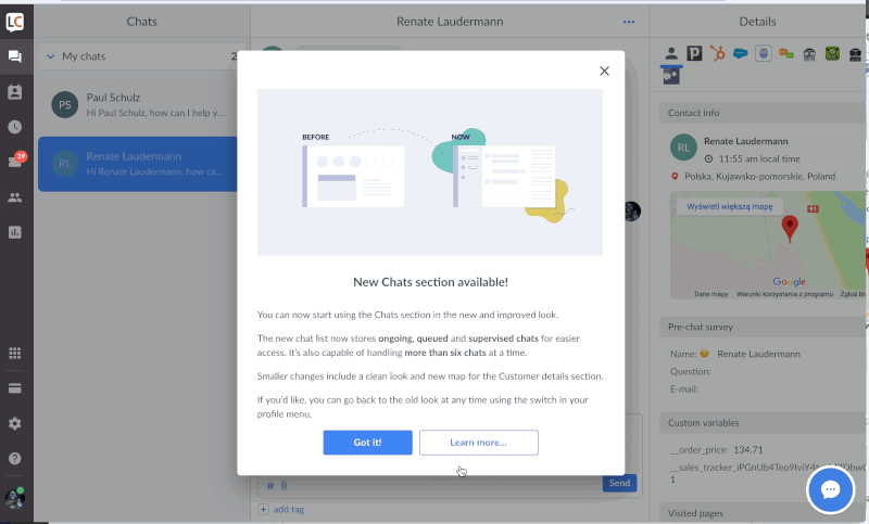
- Releasing the main part of the app too soon. The redesign started with our most essential section - Chats. We wanted to release it as quickly as possible to prepare the product for future changes. It’s worth mentioning that Chats is the most complex and advanced part of the app from the technology standpoint. For that reason, we decided to focus mostly on refreshing the UI and leave the architectural updates for later. We spiced up our tech stack, but it turned out not to be good enough in some cases. What suffered the most was the application performance. It was a dealbreaker, especially for customers with lots of chats. They couldn’t make the transition and decided to use the old version until all the performance issues were ironed out. This situation held us back and slowed down the process of phasing the old LiveChat out.
- Communicating incoming changes. After the first releases, it turned out that the information about planned changes hadn’t reached all interested in this topic. Managers don’t log into the app regularly, so email is often the only way to contact them. We discovered that our newsletter didn’t do the job. It was a mix of information for managers and agents, all in one, so both groups didn’t find it interesting and mostly ignored it. Now we’re sending two separate versions of the newsletter with tips for agents and information for managers, and they perform much better.

- No access to the beta version for our users. It was another of our mistakes. Despite updating our Knowledge Base and adding posts that explained changes in each refreshed app section, our customers still struggled with teaching their teammates how to use our product. Customers usually make their own training materials, which have become outdated and needed an update with each release. Now they can access the beta version and prepare everything early enough.
The great question is: how to avoid those mistakes? It boils down to having extensive discussions before any design or development happens. It’s a crucial moment that might save you a lot of time in the future. You should explore your project from every angle and go deep to the bottom of the problem. When having doubts, don’t hesitate to say them out loud. It’s the only way to dispel them. Consider inviting people from outside the team and ask them for feedback - they will provide a different point of view. Remember to write down every conclusion and make sure the team is aware of the current project state at any given moment. Everyone should know exactly what the background of a specific task is, what the business assumptions are, and how your decisions will affect your customers. If you don’t fully understand what you’re doing, your users won’t either. You have to be thorough.
Still making mistakes? Talk about them, don’t point fingers at people, point out what went wrong instead. Write it down and make sure your team is aware of it. If the changes are radical and simply too much to handle for your users, have the courage to revert them all. Don’t think of it as failure, but as a lesson learned the hard way. You’ll remember that one for a long time.
Never forget about metrics
Last, but by no means least - always remember about the metrics. You couldn’t tell if a redesign was a success or a failure without analyzing them. It’s worth to collect as much meaningful data as possible. This way you will be able to react quickly if necessary. Here are some tips from Jacob Firuta, our Data Analyst:
- Create a situation where you have metrics to compare to. When you plan on redesigning a section of your app, make sure you’ll have something to compare with in terms of metrics before the release. If you’re not monitoring a particular section, spend some time on adding relevant events and tracking before releasing the redesign. You will then be able to see how two designs affect the same kind of metrics. Even though this is a bit of extra work that will only work for you in the short run, it can provide invaluable insights, which will inform your decisions for years to come. For example, when redesigning a portion of the app responsible for monitoring visitors on a website, we want to see how our current users interact with this part before we add any new features. All of it to monitor how these features change the usage patterns.
- One test at a time (if possible). Try to keep the number of big changes relatively small from release to release to be able to pinpoint which release brings the best results. This can be particularly hard in case of redesign, since a lot changes happen in a short period. In our case, we limited the scope of changes to one section at a time, which allowed us to be more focused on relevant metrics. If you do need to test several iterations at the same time, make sure you have a way to distinguish between them so that you’re comparing not just A and B but A1 to B1, A2 to B2, but also A2 to B1 and A1 to B2, and so on.
- Testing before releasing, monitoring after releasing. No matter how confident you are in your design, it’s always worth A/B testing to see exactly how it will affect your users. It’s important to check on the results after the design has been released. You should come back to it after a couple of weeks and after a couple of months to make sure it’s performing well, and the results don’t stray too far away from your A/B test results.
- When A/B testing, see if your groups are truly equal. When testing, the goal is to have relatively similar groups of users trying two (or more) variants of your product. However, the groups don’t always end up as uniform as we would like them to be. This is especially difficult in case of B2B companies where the customers can vary greatly in terms of needs, used features, or company size. To account for this a little bit, we always check for any potential outliers when comparing our results. If one group seems ‘stacked’ when compared to the other, we try to normalize the results a bit or we end up extending the test period to give the other group a chance to catch up.
- Communicate your results to the entire team. This one took a bit of time to get right but is very important. If you fail at communicating test results, i.e. not only reporting but also explaining them, you might as well completely skip the test, because nobody will learn from it. The conclusions should be easily understandable by everyone in your team if they are to make any kind of impact. A team that is well informed of the results can incorporate them in their daily work and be more aware of the spaces that need improving in the next iteration.
We’re constantly checking how many customers use each version of the design and how the dynamics change after each release. When your redesign is an opt-in, monitor how many users switch to the new version, and for the opt-out, observe how many of them return to the old look. Also, keep an eye on how many people switch back and forth between the old and new design and how often it happens. It may be a consequence of poor usability of a particular feature or even a whole section.
To make a long story short - take statistics into account when making decisions - those based on gut feeling are not always right.

Give your users time to adapt to changes
Changes are never easy. Prepare yourself for the users’ reaction to the redesign as even the best-handled process can be frustrating for them. People are extremely task-oriented and often don’t understand why you want to change something that’s already proven to work. When they use your product daily, especially for work, they just want to get things done. Remember, with each change, you reduce their ability to do what they have always done.
I think that being patient is maybe one of the most important traits a designer can have. You shouldn’t listen to all the users’ complaints and unpleasant comments in the first week as they are natural reactions to changes and broken habits. Remember, these are not their reactions to you as a person and a designer. If your redesign is good, people will eventually come to like it, and it will pay off in the long run for both you and your customers.
Thanks for reading!