How our churn has changed over the years
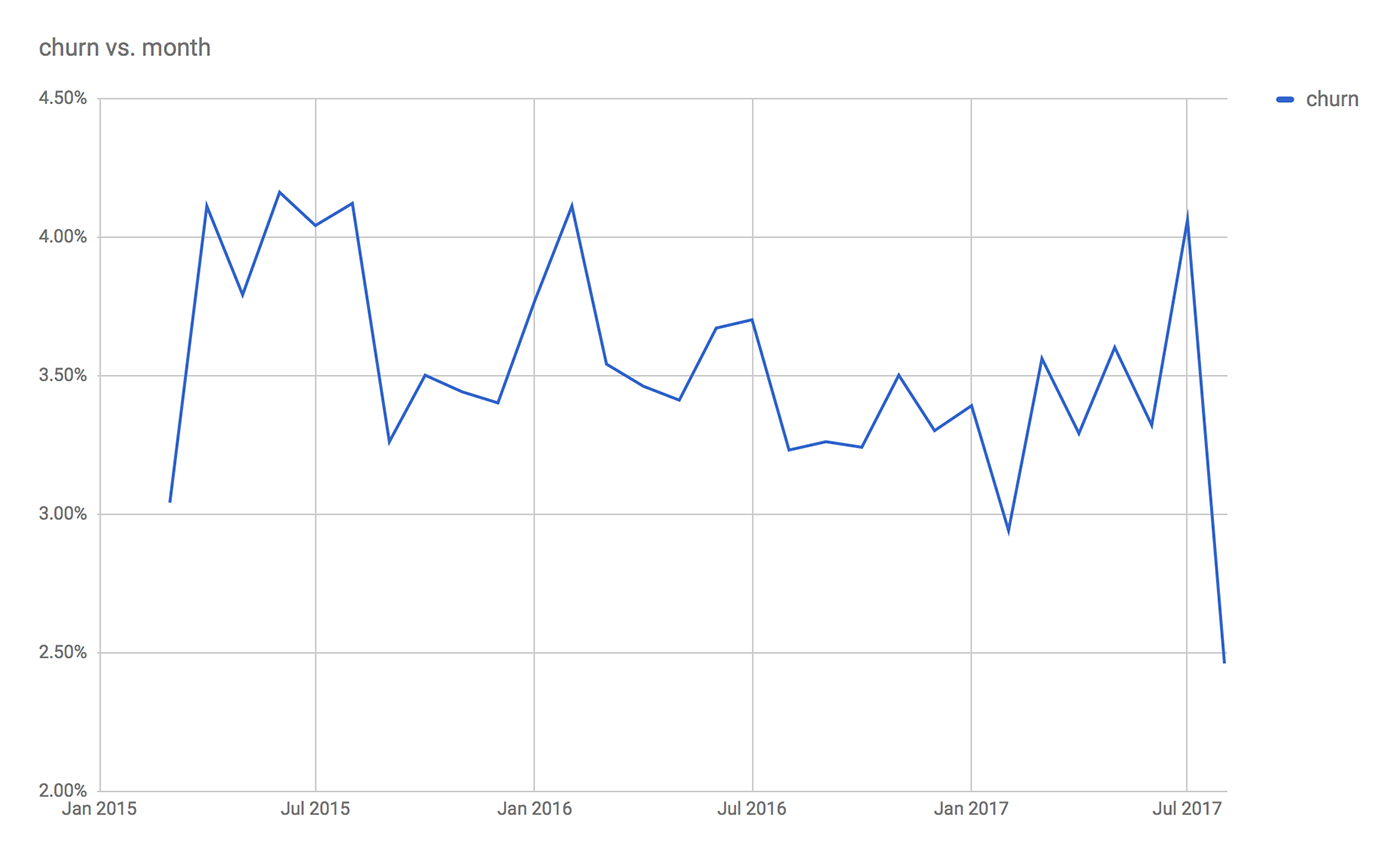
The chart below shows how customer churn looks like in LiveChat for specific months for the past 2+ years:

Chart #1: LiveChat customer churn over time.
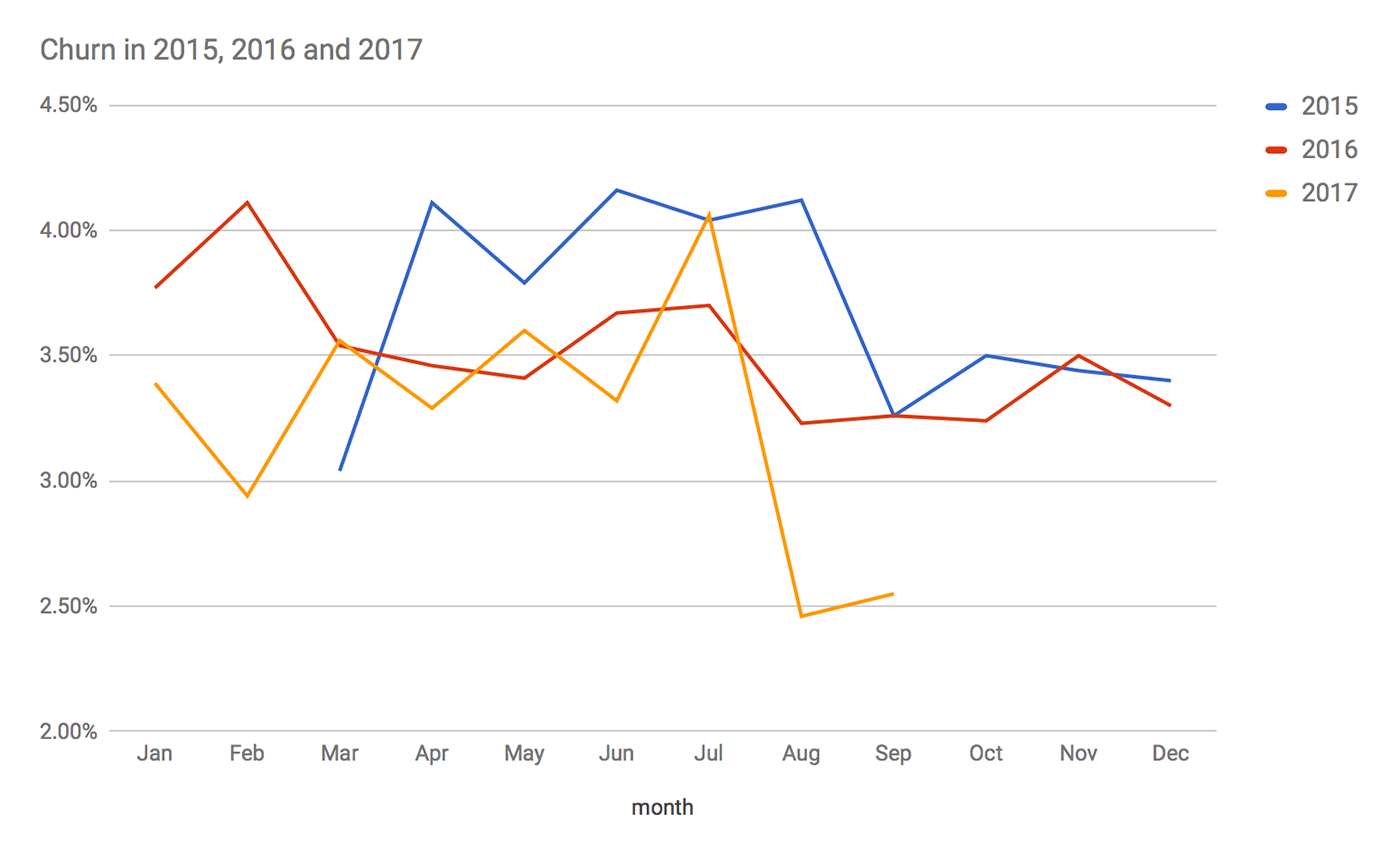
Here’s the same data year-over-year:

Chart #2: LiveChat customer churn year-over-year.
The data represents our four main pricing plans: Starter, Regular, Team and Enterprise (we didn’t have enough data about the Enterprise+ plan). As you can see, a recent addition to our cancellation form helped us reduce the number of churning customers considerably.