The past few months have been quite busy for our team. In LiveChat, we’re responsible for building the Chat Widget, one of the core components of our system that is used by end-users to communicate with support agents. As described here and in our constitution, one of our core values is to make “customer communication without barriers.” For us, communication without barriers meant that we needed to put more focus on accessibility, so we made adjustments to the Chat Widget in order to meet WCAG requirements.
What does that even mean?
“Being accessible” means providing a person with disabilities a way to use a product. It applies to different areas of everyday life. For example, consider stairs People using wheelchairs cannot use stairs, so an owner of the building has to provide an elevator. The same is for the web - different people use our Chat Widget, some of whom might be blind, deaf, or have different kinds of vision impairments. Just as the owner of the aforementioned building had to make accommodations, we should provide our customers with alternative ways of using our product. If that’s not convincing enough, maybe you should keep in mind that building an inaccessible website might even end with a lawsuit!
So, what are those alternatives? Well, it depends on the disability being accommodated. Sometimes we need to avoid some patterns. For example, we shouldn’t make elements of our UI reachable only with a mouse, as some users might explicitly depend on keyboard navigation. On some occasions, it is about not using colors that might be indistinguishable for people with color blindness. Fortunately, we don’t have to spend a lifetime researching the topic before jumping into action. Web Content Accessibility Guidelines (WCAG) is the saviour here. It is a document published by the Web Accessibility Initiative that establishes a set of recommendations to follow to make websites more accessible.
Low-hanging fruit
When we first started working on accessibility, it was a bit overwhelming. We had an already working application with thousands of customers, and accessibility was a completely new thing for us. Our initial question was not “how,” but actually “what” to start with? Before making any plans, our first task was to research how to test the web applications with accessibility in mind, and then to fix any flaws in our Chat Widget.
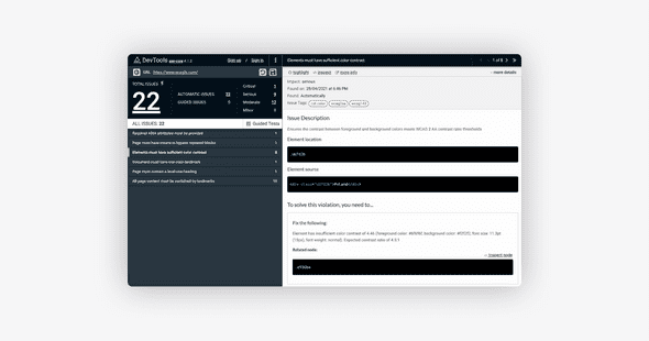
We began with static analysis tools. These tools analyze the semantic structure of the HTML DOM tree in order to be able to find some downsides. A great example of such a tool is “axe DevTools” browser extension or a similar WAVE one. You use it to scan either all of your webpage, or it’s particular elements, after which you will get the report listing all found issues.
These checks are based on the WCAG requirements mentioned above, and include the severity of each issue.
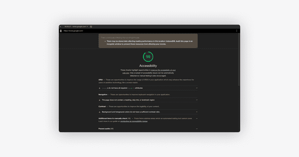
Other tools which you can use for such an analysis, if you are using Chrome or Firefox, are built in your browsers. In Chrome, you are able to run a similar automatic report using Lighthouse. Although it is certainly less specific, it is a good start.
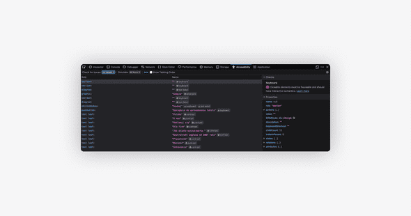
The same is true for Firefox - when you open the developer tools, all you need to do is go to the “Accessibility” tab and select “Check for issues” with the option you favor. This will provide yet another report with all the information you need in order to start making the world a better place.
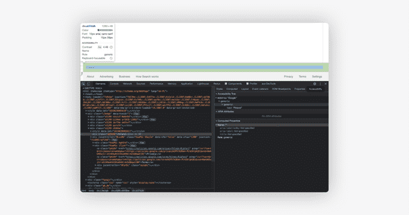
Both of these browsers also provide additional information about the color contrasts, missing attributes, element semantics, and other important things.
With all that sorted, use your imagination!
From the reported issues we created tasks to improve particular components, and we have gained a lot of insight into what to look for. Though it was a quick round of running the audits around different application states, we knew it was just the beginning. We have found that we can keep track of issues using different automated solutions during early phases, such as eslint rules (e.g. “eslint-plugin-jsx-a11y”) or cypress plugin (“cypress-axe”). That is a topic for another blogpost, though!
The second, much more important thing we knew we had to do was to make use of our empathy. We already learned which things we should pay attention to, soit was now time to check the user experience. When manually testing user experience of the accommodations, it’s probably preferable to categorize and test different disabilities independently instead of trying to test everything at once.
For example, we had to learn how the blind use the web. The answer is pretty simple - they use screen-readers and navigate around using just the keyboard. There are a variety of screen readers to use, some of which might be already in your system, such as VoiceOver, which is on MacOS. If that’s not the case, you can consider free browser extensions like ChromeVox.
In Warsaw, there is an exhibition called “Invisible Exhibition.” It’s an interactive tour “into the world of darkness,” and is meant to show visitors how the blind or visually impaired navigate around the world. For web browsing we basically did the same, and we were able to recreate the experience of using our widget as a blind or visually impaired person would in order to check it.
Imagine you are using the web without being able to “see;” you can only “hear.” Imagination can be tricky here, so you can try it blindfolded or with your eyes closed. We are used to certain patterns which are not at all accessible, and blindfolding yourself helps you to understand how wed we are to those patterns. For us, it was a game-changer. For starters, we made a run for critical and basic paths of our application, like:
- Find the Chat Widget on the page.
- Open it, fill in the pre-chat, and start a chat.
- Chat with the Agent - are you able to “read” (hear?) their message? Are you able to answer or ask any questions?
- Close the chat.
It seems pretty easy now, but it turned out that it was almost impossible at the very beginning of our journey with accessibility. We weren’t even able to find our widget on the page, so new messages from the Agent were not being read, and the user was unable to navigate through them. We had to learn how to use the keyboard, how content is being read, and which bits and pieces are viable.
This gave us more insights than any static analysis would to and made us actually realize how important it is to improve that situation. The same is for other disabilities, like color blindness. You can use various tools to simulate such a condition, learn, and then make your app better with all that knowledge.
Design with a11y in mind
The experience of using our Chat Widget in the way a disabled person might made us realize how important it is to consider accessibility at a very early stage. We believe in the “test early, test often” approach, and as mentioned earlier, we have included automatic tools in our pipeline to ensure there is no regression around particular areas. But, before development, there is a design.
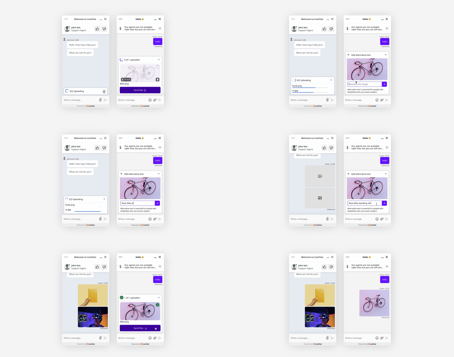
As part of the changes we adopted, we had to completely rebuild some of our components, such as the file upload. Now it provides a way to add an “aria-label” to the uploaded images, explicitly informs users about the status of the upload, and makes all content easily reachable with the keyboard. The earlier version was not accessible at all with a keyboard, not to mention that it gave only the visual representation of upload status.
We have read a lot of blogs and specifications, learnt from our experiences, as well as from books like “Inclusive Components.” All of these made us realize what we needed, and now every new feature we design and plan to implement is done with accessibility in mind.
Learn from the professionals
Last but not least, there are companies like Deque which can help you with assessment and testing. They built the “axe DevTools”! They run training sessions, provide access to different testing tools, and perform audits and accessibility assessments. Their audits are based on their extensive knowledge in the area and will help you to determine which issues to address. The specifications and requirements can sometimes be confusing, and it might be quite hard to apply them or test them with your application. This is the part when even a simple chat with a professional in that area might be helpful.
You can also use the solutions already made by professionals, such as adobe/react-spectrum. There is a lot of useful knowledge there, as well as tips on what to look for while testing.
Remember accessibility!
Although often overlooked, the accessibility of your product is of the highest importance. There are a variety of tools to help you determine where you can improve, and it’s impossible to find an excuse why you shouldn’t. I hope that our journey will encourage you to care about all of your visitors and unleash the full potential of your product.

