We’re starting a redesign process! Over the next few weeks, we will introduce a series of updates to LiveChat’s look and feel.
The first new addition you will be able to see is the menu update, which is coming next week.
The following post will give you a better idea why we’re redesigning LiveChat and how it will play out.
Why we change the look
The current look of the app has been with us for a long time. There were no major design changes for the last couple of years. What used to work may be not as useful anymore.
We feel that the design is holding the app back. We can’t easily make it more useful to you without moving some pieces around.
We want to come up with a design that makes it easy to add new, useful features quickly. We also want to give you the opportunity to do more with LiveChat. For example, handle more than 6 chats easily.
The same goes for adding communication channels like Messenger, Twitter or email. A new design will allow you to use all these channels in LiveChat.
Finally, a new design will also allow you to use the Developers Program to fully customize different parts of the app yourself.
What will change
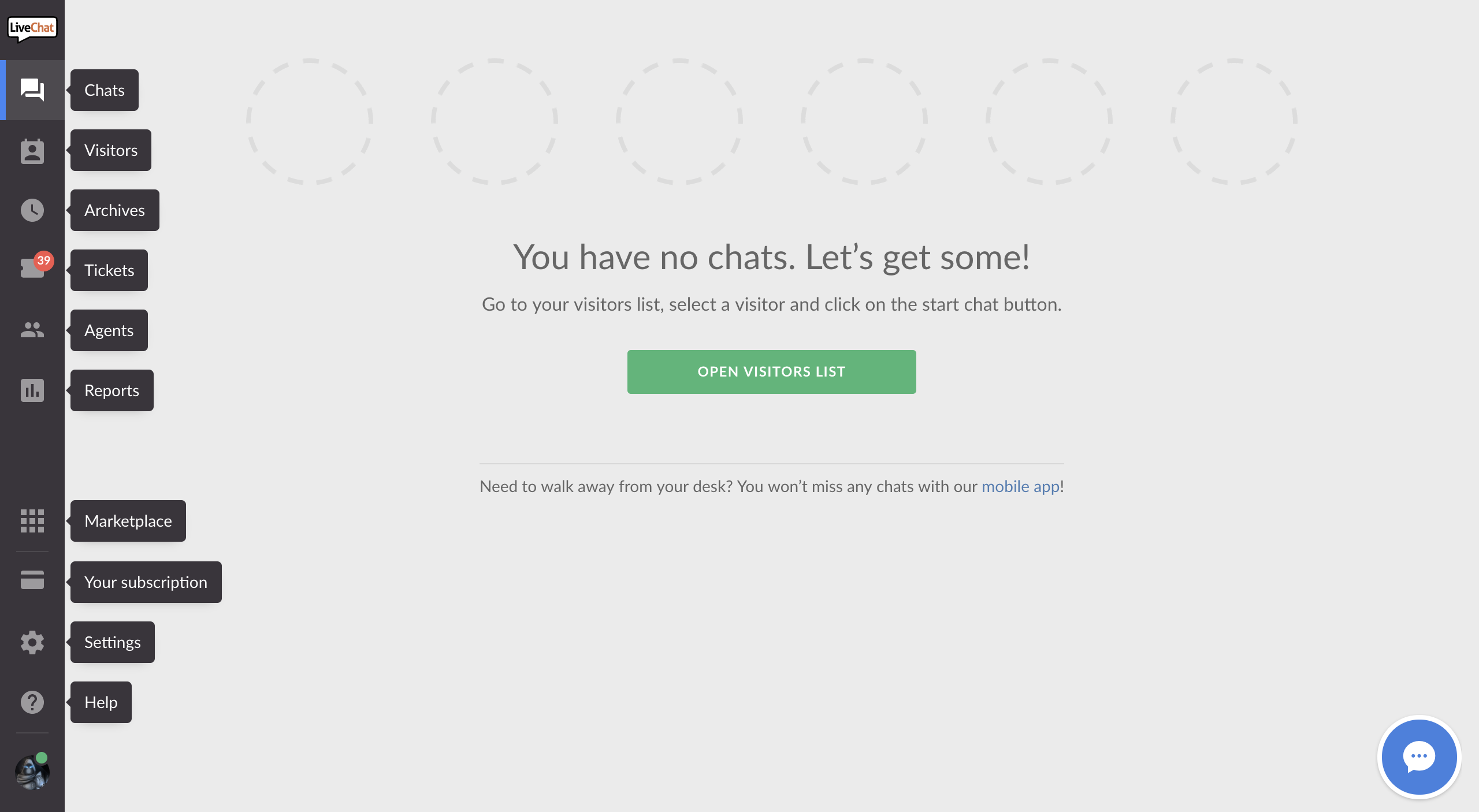
Starting next week, the new menu will appear in your app. Here’s a sneak peek of what it will look like:

We’re moving the menu bar to the left to open it up a bit and to allow for more menu items. It will also look way nicer!
All further updates will come at a later date. We’ll let you know via email and in-app messages beforehand so you have the time to prepare.
Additionally, we’ll add a switch to the app that will allow you to go between the old and the new looks (it will affect everything but the menu, which is now the same for both designs). You will be able to use the new look while being able to fall back on the old one if you need help finding something.
Once all sections have been updated, we will finish the process and introduce the new design for all users.
If you have any questions or feedback, we strongly encourage you to start a chat or write us an email!