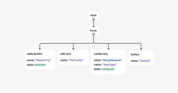
A screen reader is software which forms part of a group of Assistive Technologies and renders graphical user interface content in the form of speech or braille output. This kind of software is essential for people that are blind or have any visual impairments as it allows them to interact with a computer or mobile devices in much the same way as the screen allows it for sighted people. In order to properly describe the particular parts of the user interface, the software needs the context and/or additional metadata provided by the application developer in order to properly present the content using a text description.
There is a variety of screen reader software to choose from, and there are multiple ways of feeding them with data used for content descriptions. In this article, we will dive into this topic and show how this remarkable software makes it possible to use a computer or mobile devices without the need for visual references.
Examples of available screen readers
There are quite a lot of different screen reader applications to choose from. They can be implemented in the form of native operating system support, like VoiceOver by Apple Inc. They can also be implemented as downloadable third-party software, like JAWS, which requires a paid license, or NVDA, which is built as an open-source solution and is free to use. Screen readers can even be found in the form of add-ons to software already being used by the user. For example, ChromeVox, which is available as a web browser add-on for Google Chrome. Despite their abundance, they all share the same purpose and basic functionality, but there are many differences in the way they handle their features. Some of them are more obvious, like ones in the customization interface or available options.
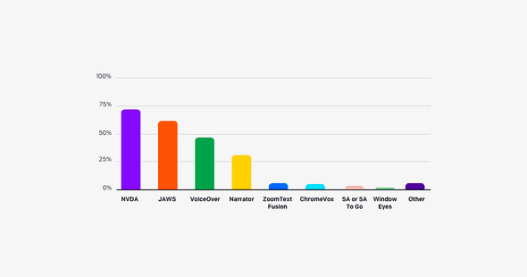
There are also differences in the keyboard shortcuts, which adds a barrier for the user if he/she ever wants to change their screen reader of choice. It is also good to keep in mind that screen readers can differ in the way they recognize application content, so it is also good to verify your application on more than one of them, just as you would when testing on different devices or web browsers. Analyzing all available solutions on the market would definitely require a separate article, but we can briefly check the most commonly used options, which according to the screen reader survey, are NVDA (72.4%), JAWS (61.7%), and VoiceOver (47.1%).
NVDA, which stands for NonVisual Desktop Access, is free, open-source screen reader software which works on the Microsoft Windows operating system. It was released in 2006 and is available in 48 languages. It also supports braille displays.
JAWS, which stands for Job Access With Speech, is paid screen reader software which works on the Microsoft Windows operating system. It was released in 1995 and was originally created for the MS-DOS operating system, and a fun fact is that this version is still available as JDOS and is free to use. It supports 10 languages. Its unique feature is the JAWS Scripting Language, which allows the user to add an accessibility layer for programs that were not designed with accessibility in mind.
VoiceOver is free-to-use screen reader software built into the operating systems created by Apple Inc. As it is available both on the desktop and mobile operating systems, it supports touch and keyboard navigation. It was released in 2005 together with Mac OS X 10.4. Its main strong point is its native support for the operating systems as they were both built by the same company. A unique feature is its support for multitouch gestures, not only on mobile devices but also on desktop trackpads utilizing the rich trackpad support in Mac OS.
Screen reader customization
Most screen readers allow the user to customize their experience of using this software. The precise set of available options differs among the various types of screen readers, but there are a couple of features that are most commonly used and supported.
First of all, the user can specify the language in which the content should be read. Most screen readers support more than one language depending on the support of a particular program.
Another common setting is the level of verbosity. This allows the user to specify how much speech feedback is needed. It depends mainly on the level of visual impairment and so, for example, users who have partial vision can use less verbose speech and focus mainly on the content itself and not the metadata. On the other hand, blind users could need the full verbosity level, including all additional descriptions of content and placement of, for example, current interactive elements in the scope of the application. This is one of the reasons why the developer must provide all available content metadata as it is the user who should decide which of them is needed for uninterrupted usage of the application.
One more popular setting for screen readers is the reading speed. This is pretty self-explanatory — it specifies how fast the lector should read the text. It is usually specified in a words-per-minute unit. In English, the typical read speed ranges between 120 to 150 words per minute, where advanced and fast screen reader users can understand content being read at a speed of even 450 words per minute. Even if most screen reader users don’t require such high speed, it is still common for them to use higher rates than that of typical spoken language. It is important to keep in mind that the first impression that long-to-read content slows down the user can be deceptive as when set at high reading speed rates, it is being read blazingly fast. Remember, don’t worry too much about long descriptions.
Screen reader usage and the Web
Each HTML document begins with an <html> tag, and this is the first place for an appropriate accessibility setting. Using the lang attribute, it is possible to specify the language for the whole document, which the screen reader will use in order to determine which language to use for speech. The second element close to the beginning of the HTML document is the <title> tag, which contains the title of the current document. It is read by the screen reader when first loading the webpage.
Web document content is always presented in a linear way when using a screen reader. This is a totally different approach for content layout than typical graphical user interfaces, which are commonly multidimensional. One of the best representations of these differences in perception of the layout is the automated telephone menu system. The webpage content is being unveiled to the screen reader user one step at a time. This implies that the structure of user interfaces needs to take into account the complexity and also the order of the interactive elements and main page content. One common issue associated with this perception difference is the top navigation menu. In most cases, it is the first set of interactive elements in the navigation order. The screen reader needs to go through all of them in order to access the main page content, which is not the case for graphical interface users. As a solution to this problem there is the common technique of implementing a “skip to main content” button, being the first interactive element on the page, and it allows for quick access to the main page content.
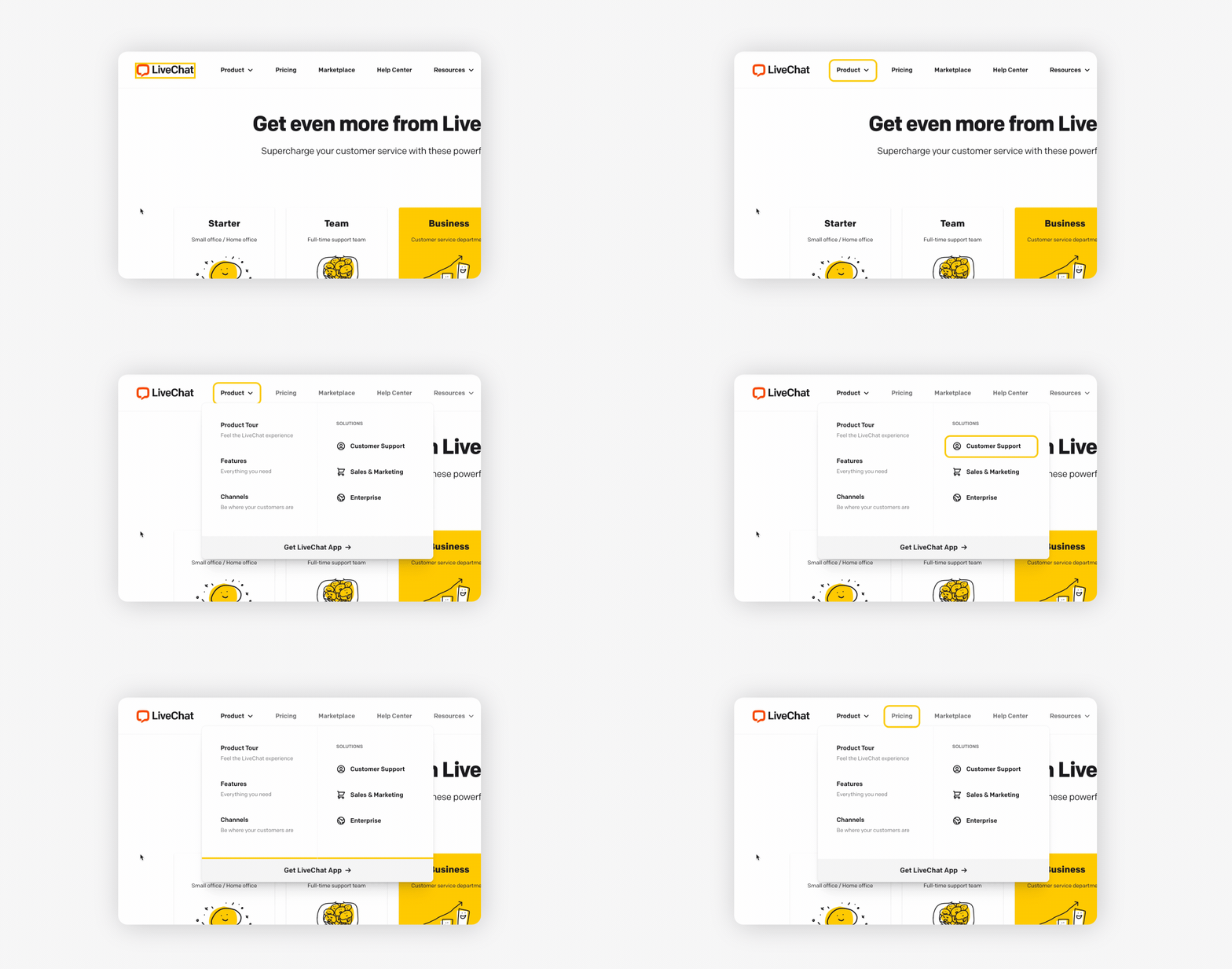
Navigation through webpages using screen readers is possible in various ways. Some of them provide users with an option to navigate content quickly, despite the linear nature of audio interfaces. The most basic navigation consists of moving one step forward by pressing the [Tab] key or one step backward by pressing the [Shift+Tab] key combination. Each step made like this will focus on the next or previous interactive element, like links, buttons, form controls, etc. The screen reader will then announce the currently focused element using its node type and additional metadata.
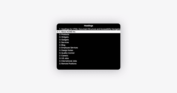
The second type of navigation available in screen readers is heading navigation. The screen reader, via a dedicated shortcut, allows the user to present a webpage map of available headings (in the form of a list), which he/she can then use to navigate directly between. This is a very commonly used technique as it allows quick access to the interesting parts of the document and makes it easy to skip those parts that are not of interest to the user. Because of this technique, it is very important to maintain a logical order in heading structure. For example, nesting an H2 element inside an H5 element should be avoided.
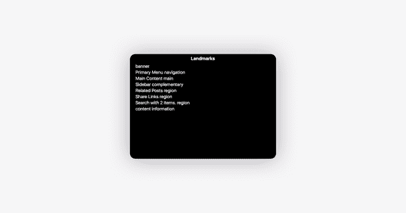
The third common type of navigation using screen readers is ARIA landmark navigation. It is similar to headings navigation, but instead of presenting a map of the heading elements, it allows navigation through the meta structure of the webpage using HTML5 semantic elements like <main>, <nav>, <header>. And also, as with heading navigation, this technique allows quicker access to the desired parts of the page while also allowing quick skipping of unwanted content. With this type of navigation, it is important to utilize the available native HTML5 elements with their semantic meaning while structuring the document instead of using <div> elements everywhere.
Regarding the chosen navigation technique, the screen reader user will rely on the information being provided by the content of the webpage to understand and use this content. Apart from the previously mentioned possibilities to provide understandable document structure, there are other smaller things that can be done to increase the accessibility of the content. For example, because screen reader users will go through each paragraph one after another and can skip one, it is good to place distinguished information of a paragraph in the first sentence. Additionally, screen reader users can also navigate by tables, lists, forms, etc.
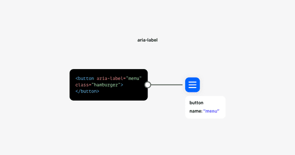
Last but not least, the webpage developer can (and should) use ARIA attributes to attach additional metadata for various elements on the page. There are quite a lot of them, and they serve different purposes. The most common is aria-label, which directly attaches the text content to the element that should be used for this element description. For example, when you have an icon button (hamburger menu) it will not have natural text content available.
The second most often used attributes are combinations of id and aria-describedby, which together creates a relation where one element’s content describes the other element. Another commonly used attribute, role, makes it possible to specify for the screen reader the functional purpose of that element. There is also one common but yet special attribute, aria-hidden, which instead of adding information to the screen reader, removes it and all its children in the HTML tree. This serves the purpose of hiding elements that do not provide valuable information.
Testing accessibility support using a screen reader
There is a lot of knowledge to be learned when it comes to building accessible applications and webpages. There is also a ton of experience to be gained just trying to do everything right. To help yourself with making sure that your webpage or application is properly accessible, it is really useful to utilize the screen reader in the workflow. The same way as we test our code locally on different devices and web browsers in order to verify if the content is laid out properly and if it works functionally, we could and should verify if it is accessible.
Of course, screen readers are not automated tools for detecting accessibility issues, but by learning how to use them, especially with the application you’re working on, it is an insightful experience. This experience allows us to interact with created applications or documents in different, but very important ways, by listening to the content being read. And because we’re listening to the content, it is easier to catch potential issues with navigation order, meaningful descriptions of images, verbosity level of the interface, and more. Thanks to free-to-use solutions like open-sourced NVDA for Microsoft Windows and the natively supported VoiceOver for macOS, it is possible to just start using it without the need for any investments.
An interesting outcome of testing applications with screen readers is that they can provide feedback as to the overall application design, which can improve the accessibility of the page for all kinds of visual disabilities or even increase the ease of use for sighted users.
Wrap-up
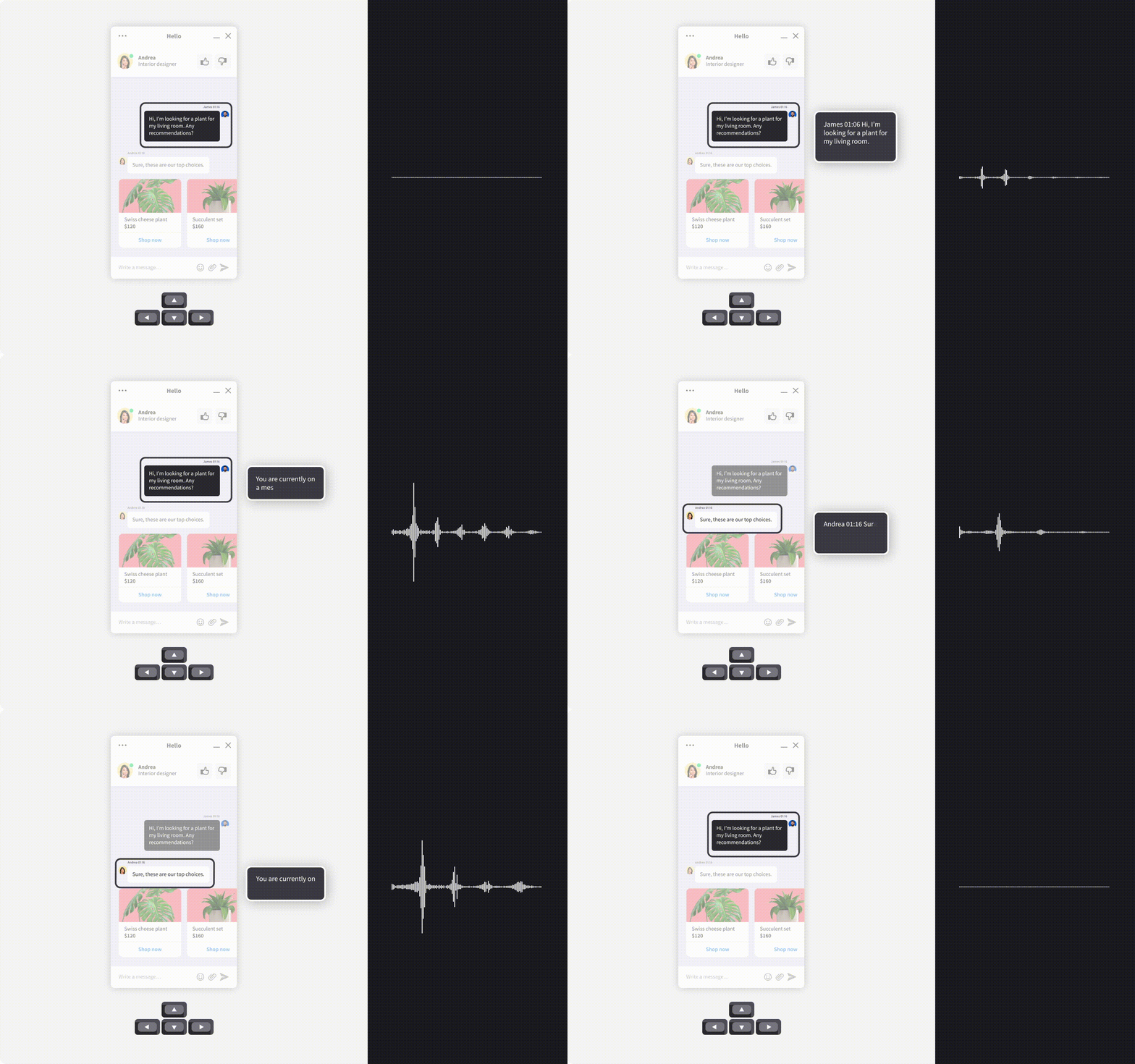
One part of making applications accessible is allowing the users to interact with them easily through screen reader software. This software is a fundamental player when it comes to possible user inputs and should be treated on a par with pointer or touch interactions. We, as responsible developers, need to treat the accessibility of our applications the same way we treat the visual attractiveness and usefulness of the graphical user interfaces we build. The amount of possibilities in terms of different navigation techniques in screen readers can be intimidating, but it is only a matter of practice to feel more comfortable using it. If you ever feel lost you can easily check the guidelines, like the ones for NVDA or VoiceOver.
